It is mentioned, but indeed it might be better if the title would be something along the lines of: Bring back the options!
I stated in my comment that I prefer the dark mode, though.
It is mentioned, but indeed it might be better if the title would be something along the lines of: Bring back the options!
I stated in my comment that I prefer the dark mode, though.
I named it “Bring back the light mode” because it was the only option they took away, it’s not like they took both ![]() I wanted to focus the petition on bringing back the light mode, which is the main topic
I wanted to focus the petition on bringing back the light mode, which is the main topic ![]()
Those of us who prefer the dark mode may not want to risk having the dark mode replaced by the light mode though, so I guess some might hesitate to sign for that reason.
They took away the light mode, but they also took away the choice. I guess it would just be a bit more “neutral” if we would focus on the fact that our “choice” was taken away.
Don’t worry! When I get all the signatures and send the petition to Viki, I’ll be sure to specify that we DO NOT WANT the “dark mode” to go away.
my vikimail is in light mode… it’s all like a chess board, once white, than black, therefore I believe the wordings should be “by signing this petition I wish to have both options available to volunteers” since they likely would not grant it to viewers… just my thoughts.
Well, my profile is a wreck. Pics won’t come up, the color of fonts I used with WHITE BACKGROUNDS is an EPIC FAIL ON BLACK. I mean, I chose PURPLE but I’m guessing some who used, what, BLACK TYPE may have …even less readable words now?
Maybe it’s great for someone who wants to not have a white screen like many of us do for what, CONTRAST SO WE CAN READ THINGS READILY?..
Maybe our profiles are “going away” and we just haven’t been told that yet. I mean, with Teams going to a TAB OFF THE FRONT PAGE OF THE DRAMAS WE WORK ON…shrug…I guess really nobody needs to see the NSSA badges, or my one picture I put up, or…really anything anyway, lol.
Let me know if you’re going to delete our profile pages so I can at least COPY my projects somewhere as a memento…and have a great weekend. ![]()
the masked marvel sigh.
I’ve written this before… All of my devices and apps use Dark mode, but that’s my choice. Everyone should have that choice. Technically speaking, I’m not even sure why the Light mode was removed… Both modes can and should be compatible with each other.
I just put all my projects in a collection, but maybe those will be deleted somewhere in the future too ![]()
I liked switching between light and dark mode.
Please, give me back my bright mode. At least, let us the choice between dark and bright ![]()
![]() I want to cry, my profile is so ugly because of that. I spent hours to create my profile and now with dark mode everything is so ugly… Plus I prefer dark mode on phone, I don’t like it on computer. I’m almost always on computer on Viki…
I want to cry, my profile is so ugly because of that. I spent hours to create my profile and now with dark mode everything is so ugly… Plus I prefer dark mode on phone, I don’t like it on computer. I’m almost always on computer on Viki…
Because you wrote this I became curious and was looking at my profile, I used gray and I have not chanced it since Viki worked on it sometimes the pictures were there and sometime like now most of them aren’t anyway.
Well the gray background is now framed with a black enclosure.
But I must say I can only read properly what is written either it is bold or big.
You are lucky… I used white for my profile.
I created pictures on gimp to create my profile, and now it looks so ugly because of dark mode.
I spent hours on it, I don’t want to change everything just because they decided to put it dark…
Your pictures are still there …
The past years - pictures are on - pictures are gone - pictures are on - back to gone …
OMG…
Well my pictures are there because I created my profile again only a few months ago I guess. Still, I remember I spent more than 2 days on it just thinking about what to do to make it like I wanted and finally… See what happened…
Just give us back the option to choose if we want dark mode or not, please Viki ![]()
What’s the use of spending hours to create a profile when it ends like this because of dark mode…
I also designed mine with a white background in mind, almost the same idea as @deval_chloe.
It became so ugly that I took a copy of it to a Word document on my device and deleted my page in here.
I was actually so upset that I decided to do it “cover-page-style” ![]() (I mean to arrange the whole thing in a picture and upload it all at once) The funny thing is that I loved all the possibilities I had with all the colors, gradients and fonts that I was almost grateful they did it so I could explore all that. XD
(I mean to arrange the whole thing in a picture and upload it all at once) The funny thing is that I loved all the possibilities I had with all the colors, gradients and fonts that I was almost grateful they did it so I could explore all that. XD
(P.S. I haven’t uploaded it yet so don’t go looking for it, you will find an empty page)
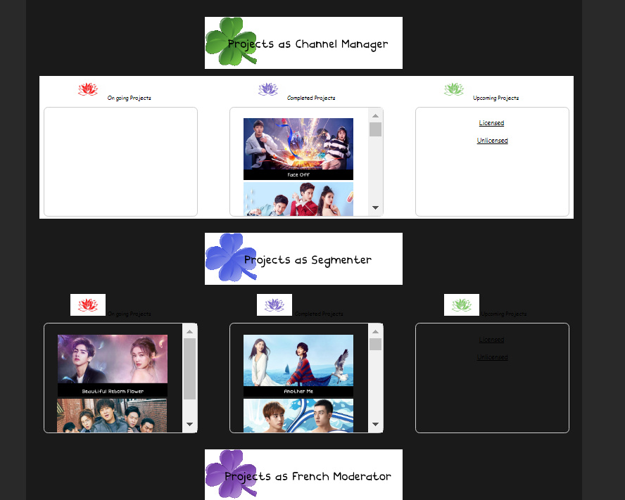
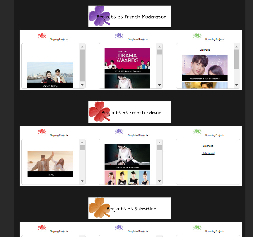
I personnally won’t create one “cover-page-style” profile because I always put links for every project I have and I can’t do it if I make it in one picture. Plus I like the fact we can have “lists” so the profil is not too long we can look at what interests us the most easier like this. It’s how I made my profile.
If someone wants to join one of the projects I have as French Moderator or other projects on which I am and don’t know which one exactly, I can tell her/him to look at the section of my profile coresponding and it won’t take too long to go on it.
And for me it’s easier if I want to check one project without having to go in overview and look for the projects for hours.
Anyway, I really hope Viki will do something about it because it’s not possible. Dark mode is giving me headache and it’s not figuratively speaking. I want to sleep when it’s dark mode on my computer… That’s the reason why I don’t like NF to start with and now Viki have it too…
That is my trouble with the new player - I start it and soon after I start realize that the scenes do not match, that is when my eyes are starting to fail on me and I won’t be able to watch another episode before sleeping, because momentary nodding off is getting a hold on me …
I’m just going to give up on redoing my profile, as you guys point out, takes days and well, if they’re going to get any free work out of me (and well, yeah everybody I guess?), perhaps they should consider not making it more difficult to read a profile to hire other volunteers onto projects. Or successfully transit this site, for crying out loud!
After all, they’ve made a mailbox that’s nearly entirely USELESS for many of us, burying our work, or even deleting things we needed and can no longer get back. ![]()
Don’t get me started on the new player, which promptly crashed and sent me out of the site and keeps logging me off and if I’m lucky, BACK ON to maybe try to continue working here. Like I count a few seconds to see which way it’s going to go…?
And…dare I ask it, when again did we give our names and addy’s for those QC gifts? Might as well throw another thing in there at this rate, cause 2020 is already half over and that was the 2019 gift?
I dunno, maybe it’s the virus and people with time to think up dark mode takeovers and what not, but the majority of volunteers by definition have to have other ways to put rice and roof up for families and themselves. At the risk of being uppity, I’m going to suggest maybe less disruption and more sanctuary here, as many of us use this to dispel the demons and sadness of the world at large and…it’s becoming difficult to do that. We’re trying to bring comfort still by our efforts to countless others around the planet, maybe peace would help us focus and who knows, maybe less depressing darkness and gloom…?
I have saved somewhere the instructions by piranna and other French html gurus on how to put a background of any desired colour. I have to find it.
Here it is:
<REMOVETHISp style="background-color:#FFFFFF;"REMOVETHIS>/REMOVETHIS
and,
![]()
This means you put <REMOVETHISdiv styleREMOVETHIS="background: HERE YOU PUT THE COLOUR CODE> And here you write your text <REMOVETHIS/REMOVETHISdivREMOVETHIS>
Remove what I told you to remove.
You can find the various colour codes here:
https://htmlcolorcodes.com>
However I tried it and it didn’t work. Then I tried making all the purples into pink and all the blue links into light turquoise.
But every time I tried to save my changes it logged me out.
It is not just that it looks ugly I can’t read it clearly now because of lack of contrast, e.g. the list with your projects and your role is not readable for me it is just a ■■■■ grey area instead of before when I could clearly see if it says, moderator, subtitler etc.
The channel page for dramas, below dramas is also too unclear, so everything has too less contrast now. Some pages use ‘dark’ modes instead of bright but they don’t use such a black type, they use use colours that do not change the contrast up to a level that it gets unreadable but maybe they don’t care about those who need to read too and only care about those who click on the play button.
(Some profile pages look as if it is a death notice, what a bad joke.)
I’m so glad that I set up a pink shade as background when I created my profile, luckily it wasn’t affected. If someone want’s to try, you can use the code below (remember to remove the space before “div” and “>”, otherwise it won’t work).
< div style=“background-color:#ffffff;margin:auto;width:100%;text-align:center;” >