Don’t like it. Would have liked it if Viki spend more time (and money) and finally give us a subject line for PM’s so we don’t have to dig our entire inbox when we are looking for something.
I do like the volunteer’s box because it shows the progress for subtitles of new shows and usually the dramas shown in that box are changed depending on
a) new espisodes for on air shows
and
b) new subs on these shows
So if they remove the box it’ll be harder to know when new epidodes/subs are up for a certain show.
The new layout seems to have way too much unnecessary clicking…
I have to check this. You know that you can increase the field for the text of the message you are writing by pulling the little triangle at the bottom right corner, right?
![]()
![]()
![]()
So funny and so sad at the same time…
For me it only worked for a while. Nowadays, every now and then it appears, then most of the time it doesn’t. It’s a bit capricious (I use Opera, which is based on Chrome, so Viki staff have always told me it’s perfectly okay)
But the organizing of the inbox is the most important part for me. To be able to find an oldish message without spending two hours, to be able to delete all the group messages you sent to your team in one go. Now if they are on the lower half of the page, if you delete them, then the next ones come take their place and so on. You have to start from the older page which is full - but it may not be full either, so you have to pick and choose… Oh, a nightmare.
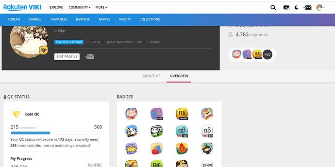
By the way, let me whine a bit about something else. Our profile page.
- In all white, sticking out like a sore thumb, “Edit your profile”. How many times one needs to edit one’s profile? I know I have never touched it since I first joined Viki. It was nicely hidden in the far right menu, why did they need to duplicate it there, where you may even click it by mistake?
- The badges are both on the side of the header, some of them with + and a number, AND again on the center column under the header. Why this repetition? I get it that if on the right, they weren’t all visible. But the badges are not the most important thing.
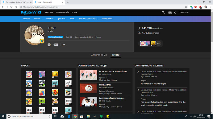
- The right column is completely empty. Why? When the really useful things, i.e. Contributions, the one that we all go for when we visit someone’s page, as well as Collections, that we use often, especially those of us who have put in Collections the “Dramas watched” and “Dramas to watch later” are buried down under the badges. If you have many badges, this means quite a bit of scrolling. Why not put the badges on the far right column and the Contributions in the central one.
I’m the perfect example of your number 1. I often edit my profile, So it’s really helpful for me. But I can understand that it’s pointless for some.
I don’t get though why your right column is empty. I see badges on the left column, project in the middle, and contributions on the right. That’s weird.
I would be a bit more in favor of a remodeled Viki, if only I could stay at Viki and wouldn’t need to log back in for almost every glimpse I take at the “new” Viki.
So far, I don’t like that inbox and watch history need another scroll or click or even use of the mouse to get there … I do see a red button for an unread message on my profile picture, like it used to be with the mail envelope, even though I don’t think there is a number …
The appearance of the main page - seems like German television’s (I don’t know for whom this could be a compliment, or if it is one.)
I really don’t like that the page needlessly changes to my native language, though I always use it in English.
And it’s a mega letdown that when I open a new tab or want to open my profile I need to log in again and again and again.
Is anyone else having trouble signing in? I’ve been struggling for the past hour. At first I tried to login through ■■■■■■■■ and that was not working. I deleted the app from ■■■■■■■■ and tried to log in again a few times, and nothing. Then I logged in with the email itself using a new ■■■■■■■■ and that worked for about two seconds before I was kicked off again.
I am unable to login - the website seems to be broken since the new release
same here. Seems they are down
Dito, but since discussion is still available …
I am going to sleep just hoping it’s like always when it comes down to this a few hours later it will work as usual.
Good night, everyone.^^
P.S.: Edit - https://support.viki.com/hc/en-us
https://support.viki.com/hc/en-us/articles/360026047473-Problems-with-Viki-Login
With the new look there comes new bugs/problems.
I can’t enable the sub. I mean the ■■■■ scrollbar is in the way, I thought it wouldn’t be a problem becaues I can see the button, but no it doesn’t work, you must fix it. I mean watching without sub makes this website useless. You should fix the box-size, so that the scrollbar isn’t over any button, nor the edge of an button.I mean I can see neraly the whole button, but it doesn’t work. But I can set the sub in english so I see it’s the button problem.
I bet it would fix it if you make the text “sub…” as a button, switched on in blue, switched off white. The simplest solutions are these two ways/possibilities.
I wasn’t online since a few years and I had no time to watch anything here, but this bug f***ed the meaning of this website up. So I’m looking now for another website, where I can watch it legal with sub…
VIKI will do whatever they want when it comes to design of the web site layout. If you really don’t like it they have left a place after viewing the new design, for your feed back VIKI do want to know your opinions. Personally I feel if it’s not broken don’t fix it .I don’t care what they do as long as my Asian dramas keep rolling in and subtitles added as time passes. ![]()
That’s very weird. I tried to make my window smaller to fit everything so that I could show you. This is the situation now, from top to bottom:
This is weird. I went back to it and I saw, in front of my eyes, the various elements switch position! How is this possible??? And they became like that (I still don’t like the badges in the middle of everything)
Maybe it was a bug affecting some users and it’s in the middle of being fixed?
Let’s hope so.
Hey there @yve,
That looks like an odd bug. As of today, we haven’t touched the video player on the redesign. I just tested and I’m unable to replicate when you’re seeing. Could you share with us what’s the browser and OS version you’re using on your computer?
Thanks,
Mariliam
Hi there @irmar,
There’s currently no work done or released on user profile. The badges card will show on the center as the QC Status card will move it to the center when you visit your own profile. If you take a look at your profile screenshot shared by @justine_desmoulins, you will see the card go back to the left. This hasn’t changed for a few years. ![]()
You will also see the cards shift when you resize your browser screen as the design is responsive.
Hope this helps!
Mariliam
I’m so glad it will be left alone!
However, I had not resized the window when I had the problem. It was full screen. I only resized it to take a picture to include most things, to show here.
I actually update my About Me page every time I finish translating a series or start a new one. I find Project contribution board to be severely lacking and just organize my own project list.
Hahaha!
Me too! But the “Edit profile” is not the “About me” page. Edit profile is where you put your name, email and profile picture. That’s why I said I’ve never changed it for years.

