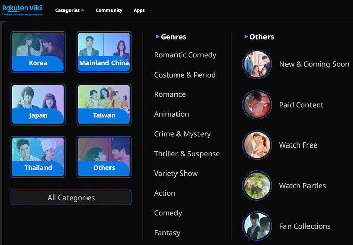
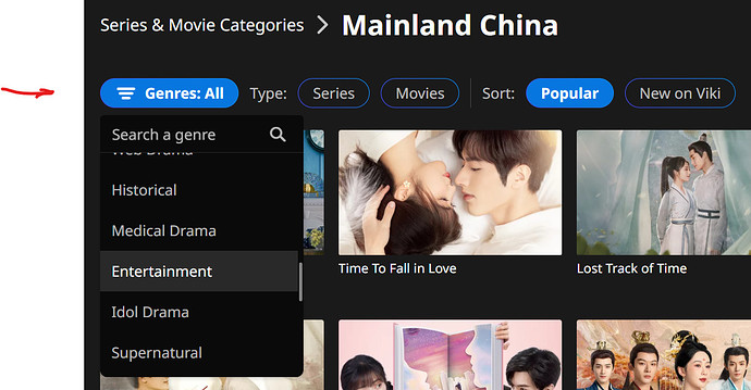
That’s my first ever topic to post but i really want to know, do you like the new search/ explore page?
Am i the only one who feel lost? i mean, some of the “new” dramas has been here for years, sometimes i can’t find a drama, i know for sure it’s here, from the category. like the Vietnamese projects, i worked on these projects so why i can’t find them while searching?
It’s chaotic and a barely use it… why the change for worse when the old was good??
The choice between “Popular” and “New”… is so… ![]()
![]()
Right? right? i was feeling like i’m going crazy lol, in the old system i was able to search by language, recent, category, etc…
In the new one, they removed a lot of these icons & it’s so messy. just why???
Because someone made a suggestion and the designers didn’t know what else, my guess ![]()
![]()
Ha Ha! I don’t usually pay attention to look at the explore, maybe I’d have a look at the main recommend banner at the top but I’d thought I’d hop over and see this sad state of affairs that you mentioned and in New shows the very first one was My Lovely Liar, I clicked on it to read the synopsis and check the year of the drama and it’s only got Kim So Hyun as FL! My V. V. V. V.Fav Korean actress ![]()
So if I had not gone over there to look I would not have been the wiser this show was on.
So since I’m on cloud 9 right now, I’ll reserve my biased judgement as to how bad things are / has become.
To be brutally honest, I’ve not noticed any difference ![]()
![]()
Are we talking about a recent change? What are we comparing with???
Now, If you’ll excuse me, I’ve got a new drama to binge on! Speak again when I resurface in a day or two! ![]()
![]()
Maybe because you didn’t pay attention to it but the previous system was allowing us to search by the language, country, category, if the project is recent, etc…
the new one has only 6 main categories & 9 genres after that but my main issue is that not every project are included. for example, all the Vietnamese movies . also there are projects that’s been there for years but in the “coming soon” category like that movie “the living dead” , i was the Arabic mod so i know lol
why dramas like “Descendants of the Sun” & “Angel’s Last Mission: Love” in the new category?
You have such a humor ![]() Enjoy your Beauties on screen
Enjoy your Beauties on screen ![]()
The explore page / categories isn’t new but it wasn’t like this. I find it very unpractical or user friendly… for me it’s chaotic… because I could get through better with the old design…
Every some 6 months websites not Viki only change features, remove or add things, they think it’s better… but new isn’t always better… the progress of digital life… also more cookies and tracking… it just eats up data as well, but that’s another topic…
you know what, i really miss the old one , also the project finder page. i was able to detect the new projects immediately but now i can’t tell from how chaotic the page is.
they keep adding projects in between projects so suddenly, i find projects at the end of the page that i didn’t see b4 & since i’m usually looking for a specific genre so i know i didn’t just miss it.
The Project Finder is in your dashboard header of you Contributor page, but what I miss is a short summary pop up I think it used to be there. You have to open a page of the show or movie in order to read the summary.
You can select preferences in the project finder as well…
Maybe we need a petition to get the old system back. And why they never ask us if we like the changes they made ![]()
![]()
![]() i mean, they keep saying how they did these changes to make it easier for us so why not checking with us if it’s really easier now?
i mean, they keep saying how they did these changes to make it easier for us so why not checking with us if it’s really easier now?
Just to be clear you’re talking about this?
and they shuffled this around, cut down on filtering?
I don’t remember much of the old system because I hadn’t been with Viki that long to have gotten used to it but I do remember it changing to this format, and Yes, I didn’t think much of it back then along with everyone else!
yes, i’m talking about that page.
the old one had bars on the top to change the country, language, genre, etc…
at least for me, it was much easier to explore.
I still think the biggest mistake on this page is lack of language filter.
For rare other languages the viewer is under the impression nothing is translated. Because they can’t find the content which is.
A language filter would be difficult to set up. For example, if you’re looking for dramas translated into Spanish, what do you return? Dramas whose episodes are 100% translated? 96% translated?
I still use this url: https://www.viki.com/v1/explore
It doesn’t work well but I hope they never remove it.
I get your point about the language filter but for me, when i became a CM, i used it to look for mods.
say, i wanted a French moderator for my project, instead of clicking on random projects to check if they have a French mod, i would just use the filter & check the projects that popped.
The one they used to have was when the first episode was translated to above 95%.
Oh, that was clever!
Oh, the filter existed in the past? ![]()
I don’t remember it.
You literally posted the link, it was under "subtitle " ![]()

