The new Video player beta version - I hate it!

This is the feedback I sent Viki
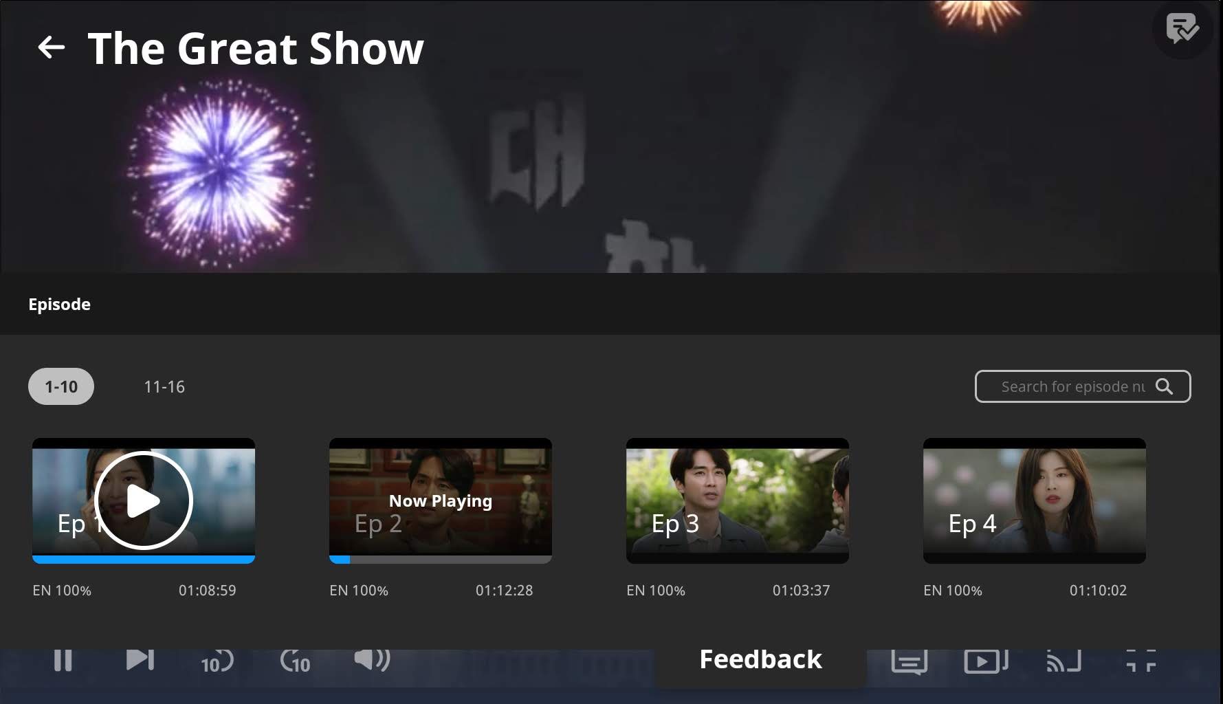
1. Navigation to all episodes
I like the navigation to episodes but I don’t think it’s useful to have it on the video screen itself. It would be enough to have it on the page under it. While you’re watching an episode, all you really need is the next one.
2. Next episode button
The next episode button shouldn’t be on the left, near the pause button. It could be mistaken for the play button. Yes, I know, it has the little vertical line which signals “next”, but this is clear when there is pause, play, stop, forward, backwards, next and last (as in VLC player and physical CD players). If it’s the only one, near pause, the logical thing would be to think “play”. And if you have the navigation to all episodes on the right (please take it away completely!) then it makes sense to also have the “next” button there as well.

3. The "ten seconds before ten seconds after"
This is only useful if you want to write a timed comment, but that feature was already there and is still there. So it should appear only while you’re writing a comment. why crowd the toolbar? Okay, this is not really important, you may leave it if you think it’s useful for some people.
4. The timed comments
Two very thick and obnoxious lines (one for the username and one for the actual comment), they draw unwanted attention to themselves. Please make them with thinner characters and longer lines, just as they were before.
5. The show’s title on the upper left corner
This, if clicked, brings to you to the main page. This is distracting and useless on the player. It was perfectly alright to leave it on the page, under the video, as it was before. Moreover, since it’s on the top, it pushes the timed comments lower down, so they are really distracting as well - adding to their big size and the fact that the username is on one line and the comment on the other one. More things to take off from the video itself. The timed comments can be hidden, but the title cannot!
6. The opaque screen is gone - This is a good thing!
I am grateful that you removed that terrible opaque screen urging you to write reviews even if the show hadn’t ended.
7. Once the show has ended, no way of going back
If the countdown to the next episode has started, there are no visible tools to stop it and go to some other point back to rewatch it, or go back to the page, for instance to read the comments or whatever. There are no controls visible, nowhere to click. I frantically clicked everywhere on the screen, to no avail. You feel trapped and suffocating. The only way is to use your browser’s “back” button. Please fix that!
7. If you have finished the video, but want to go back there is no way at all.
There’s only the back arrow taking you to the show’s main page. (This will encourage people to write inappropriate comments on the main page instead of at the page they belong to)
And if, from the main page, you go again to the list of episodes modal page and click on the episode, you’ll automatically be taken again to the ending exactly where you were, with the countdown to the next episode. And, since the progression line isn’t showing, you can’t click on that to be taken to a previous part of the episode. I tried again and again, to no avail. So frustrating!

8. You’re trapped in the player
The most frustrating thing is that, even if it’s not fullscreen, you don’t have an option to see both the player window and the page around it . Actually the non-fullscreen is almost as fullscreen, you’re trapped in it.
Once you click on the episode, there’s no way to go back to the surrounding episode page, the comments, the clips and episodes list etc.
Suppose there’s a medical or action/war drama where they show gross stuff you don’t want to see, or a horror drama where they show something scary. And you want to scroll your browser window down a bit, to only show the subtitles but not the whole screen because you don’t want to see nightmares afterwards. Yes, you may laugh, but many of us are doing that.
Or maybe you’re reading some other thing on the page while the introduction credits are rolling, to then scroll up when the actual episode starts (think those interminable introduction credits on Chinese dramas). No way to do that now.

9. If you’re a subber, it takes longer to go to the subbing tools
To access the Subtitle Editor and the Segment Editor, you have to click on the video. There, you have to wait for a few seconds staring at a blurry screen until things show up. For volunteers who have to hop from Editor to episode to main page to Editor again to check stuff, it’s very frustrating.

Suggestion:
All the navigation tools should be outside the video player, on the page under it. While you’re watching, you’re only watching (and possibly commenting), you don’t do other stuff.

End verdict
All in all, I think you did one good thing (removing the screen at the end) and added a whole bunch of completely useless things which we never asked for (why am I surprised?). I personally don’t like it at all. I’d be extremely unhappy if you implemented it as it is right now.

POST SCRIPTUM:
Oh wait! The whole episode page with the comments is gone! I’m not able to access it from anywhere! That’s why they put all the controls in the video player itself. Now where are we going to discuss each episode, spoilers and all? This is terrible, terrible! I think I want to cry!

29 Likes

Although the new video player has not been implemented for me yet, and therefore I can’t express any opinions about it, but I have to disagree with this one.

I use this button all the time. Whenever a subtitle goes away way too fast, or if I get lost in my thoughts and skip a scene and have to go back, this is the button I use.
I don’t like scrolling along the scrollbar for tiny rewinds like that because it usually takes me too far away from where I want to be.
So I like that it’s still there regardless of the other stuff you’re upset about. (I also am upset to see that the episode comments are gone. :frowning_face:)

Have you tried the escape button on your keyboard? I know that in the older browser there used to be an “x” but I actually always used the Esc button. Now that you’re saying that the episode page is gone, I am kind of curious to know what would happen if you click it.

6 Likes

Me too! It’s very useful for return and see again the scene, I can read and understand the sentence better.
I usually wacht on my Fire TV and one thing that I miss is the option of have a PIP of the scenes when you go forward or back. Sometimes there are scenes that I want skip so the PIP would be great for that.

3 Likes

I would be happy if anyone could enter per phone the episodes -.-

Shortcuts
They might add a shortcut video player for us to use with this new vid player:

.https://support.viki.com/hc/en-us/articles/228306768-About-HTML5-

09

We already have shortcuts for subtitling and segmenting.
I hope they can put video shortcuts somewhere in one of the video player’s sections called “Video shortcuts”

So far, I know only 5 shortcuts:

  • left, right arrow (+/- 10s)
  • up, down arrow (+/- sound until mute)
  • escape (from full screen mode to smaller screen but not from the video player mode)

Except trying different combinations on my keyboard, I don’t know how to know shortcuts and I think some viewers don’t know them too.

I like the new look.
It doesn’t change much from the previous one, except for 4 things maybe for me (only my pov):

06

(Note:
-I don’t know if we have shortcuts to:

  • skip directly to the next / previous ep.
  • go from the video player mode back to the drama main page.

-the video pauses regularly on my side when I skip 10 sec

-And the 2nd sub is on the black ribbon at the bottom of each video, or the subs are like a little near the limit between black ribbon/drama video)

46
51

(Is there a possibility for viewers to pick the place where subs appear on screen like YouTube?
Either subs appear on the black ribbon to have full view on the drama
Either subs appear above the black ribbon, on the drama video)


For viewers, the video player is better.
For volunteers, it is something else.

More viewers than volunteers and I think the new video player was thought for viewers.
As a viewer, I prefer something like that to watch on.
As a volunteer, I think it won’t change much my ways.

We do.
There is a strip from where you can choose to go to any episode.
There is a huge obnoxious arrow with the drama title in big letters which messes up all the left upper corner, and it will take you to the main drama page.

You wrote:

I prefer to have 1 page of comments instead of 50 pages of comments for 1 drama for each episode.

Then tell me, please. Suppose you have just watched episode n. 9 of a drama. You are eager to know what other people who have watched it think of it, and contribute your own thoughts. Okay? You go to the drama’s main page and you find the latest comments. Which may be about anything: about the drama in general, about the lack of subs in episode 16, about a bomb in a Korean mall or the latest scandal of one of the actors. Where do you find all the comments pertaining to episode 9? Unless you’re watching as the drama is airing, of course each viewer has watched the episode on a different day or month or year, so the comments for episode 9 are scattered all over, on a loooooooooooooooooooooooooooooooooooooooooooooooooooooooooooong page. You scroll and scroll …
How many hours will you have to scroll down to find some and reply to them?
And, will everybody remember to write about what episode they are writing about, or which ones they have watched so far, when they say, for example, “Oh, this character should have done this and that, her reaction was not realistic”. Uh? Where exactly?
Or, who will see your comment you just wrote, and who will be interested? Only the few people (2, 3, 10?) who happen to watch the same episode on the same day as you. No discussion, really, because for a general discussion, everybody has to exchange opinions at the same time and place. - one under the other, with all the dialogue and replies easily grouped.
Even if you do watch on-air, and your comment is near the comments by other people who are watching at the same time (separated, of course, by a number of unrelated comments by sub-whiners and license-whiners), they’ll all soon be buried by all the other comments of people who started a bit later and are now watching episode 1, 3, 6, 8… Because they all have only that one page to write on.

Genius idea, really.

5 Likes

I mean keyboard shorcuts.
Do you know some more by any chance?

My pov only because I don’t watch the same (each one has his habits):

Before watching:
I don’t really read comments from a particular episode, because if I want to watch a drama, I wait until it’s finished, read the summary, read some reviews from people who watched it (fully if we can tell from reading), read some comments on the main page just to have an idea.
But not going into full details or an episode in particular, because the magic will be gone for me or I might not understand the scene they describe.

While watching:
To know reactions from an ep:
I pick timed comments to know reactions of people when they watched it (live but not really live).
And I watch to watch, so I usually don’t comment, that is why leaving everything to be simple (just the video mode without comments under, with the essential buttons a viewer could use when watching or binging) is fine for me, because I watch like this on TV or on computer. I let the app guides me. More intuitive.
And that’s what I do to binge.

I don’t think of going into each ep comments section to read comments to see if from an ep, it goes downhill, because I can’t know where to look when I pick and I don’t like too many spoils so I won’t read.
I won’t look into each ep and would follow overall review.

After watching:
If I were to read, it would be probably after watching the ep, but then I would be in a binge spree and I already read timed comments.
If it’s really good, I normally don’t take the time to read comments and continue watching.
If it’s not really to my tastes, I stop watching without reading more comments.

And I think ppl would leave a review at the end at this moment.


On Viki side:
With the traffic stats or surveys, they must have info on our habits of watching, they should know if we watch more on TV or on computer.
On TV, they don’t provide comments on my series (cable, Netflix, replay) and I just binge.
I have the same behaviour on computer.

I don’t know if people use the comments section of each page to comment about the episode.
Viki probably has checked this before (I think) and they might suggest they want to highlight timed comments?
I might remember not correctly, but I remember filling a survey about using timed comments or comments? (I don’t remember well)


Yes, I know not everyone is watching the same way. That’s why I’m fine with it (for me).
For others who use the comments pages, it will be la macarena (in red: we’ll see).

For checking comments: having 1 page is better.
To follow the story by ep and comment by ep: red zone. More than 1 line comments: not timed comments use.

Most of us go there only after watching, because there are some things we feel passionately about and we want to discuss with others. And people will reply “I know, right? That’s exactly how I also felt!” We also share our guesses on how something will end, or what is the reason something happened. Sometimes we get useful insight by other people, especially native Asians, who explain some things about the culture which we find puzzling, etc. Then people from other cultures say “hm, we have something similar in my country, bla bla bla” and others “Ah, now I see why they put so much importance to the meeting as children and fated couple”
I have made many “friendships” discussing with people that way.
Recently, on 100 Days My Prince, there was mention of the shape of the cherry tree petals, so I shared some of my research (that I did in order to edit well the subtitle), with images of the various shapes of plum, peach and cherry petals. Some time ago, in Hotel del Luna, there was a reference to a crane for a person of Joseon times who had passed the State Exam, so I had done research there as well and I shared a picture and info about the crane embroidery on the plaque they had on their chest, denoting official rank. One crane, two cranes, a dragon… the meanings of those things. I got quite a lot of upvotes for that crane post.
All of this cannot be done in the timed comments (1. they are too short 2. the person you’re replying to will never see your answer because they won’t be watching again and 3. your comment may be buried under someone else’s). And certainly not on the main page.
Okay, you don’t use them, I respect that. But for us who use and love them, this is a HUGE LOSS. And you know I’m not an all-caps person usually.

5 Likes

Yes, I think this change will be difficult for people who use the comments page the way you describe :slight_smile:
I wonder, once you said that, if Viki could take another look to what you told us :wink:

It brings some questions:

  • what to think of info about other ep on the main page?
    Before it was considered in the majority as spoilers, but now, I don’t know with this change.
    All spoilers will be on the main page.

Now, what does Viki recommend about this? What volunteers should do about spoilers on the main page?

By any chance, were the references (shapes of petals and embroidery) also in translation notes? I don’t know the dramas or the scenes, so I don’t know if it was possible to put these details in the drama subs.

Or maybe did you use timed comments for these references?
That would have been an interesting way to use timed comments like that :thinking:

PS: Almost forgot! I didn’t notice you didn’t use caps, but I’ll update the profile data I have on you!

Where do I see it? In subtitle tool or normal mode on the page?

(for me it looks like always)

1 Like

A first look at the newly updated player. Please keep in mind that it’s still in beta, so hopefully, VIKI will take notice of everyone’s suggestions.
Also, this post needs to be pinned.

Fotor_157635781516147

Fotor_157635784686916

2 Likes

It’s a gradual implementation since it’s still in beta. Above I’ve uploaded some screenshots of the new player. Please take a look at them.

2 Likes

Now that I’ve seen it, (Thank you @adrianmorales) I agree with Irmar about the ‘next episode’ button. It does seem to be the ‘play’ button when it’s next to ‘pause’ like this.

3 Likes

Thanks for the screenshots.

It seems they use the Youtube layout design for their new player.

Somehow there wasn’t a new VIKI design yet I liked… I was fine with the old layout for most cases and the new doesn’t seem to make things better.

3 Likes

As you know, space is very limited on the subs themselves. I did put a very condensed version of the info - since that was my purpose in researching it anyway. And since I had a nice picture to go with it, I decided to post it on the episode’s page.
I thought that it’s good to have more posts that are not whining about subs. They encourage different sorts of discussions and make viewers more patient.
The petals info is here.
Another time, also on 100 Days My Prince, I did a research on rain rituals (of course, while researching I learned stuff on many other Joseon rituals as well), and found out about the Dragon King Ritual, where they used various styles of dragon depictions. Very interesting. It’s here
At the time of Hwayugi I had found and posted some interesting info on story of the magic fan the Monkey King took from Princess Iron Fan - the feather fan they used in the drama was not accurate - the enormous fan was supposed to be made of banana leaves.

If you want to see an example of some insightful conversation, try here and here.
There is this user called Whack whom I have come to love and respect. Whenever he comes to the comment section, you’re sure to learn lots of things about Korean and generally Asian culture and hear intelligent points of view on plots and character psychology. Sadly I don’t meet him that often nowadays.

How they are going to handle the spoilers? Two options.

  1. Continue to forbid them completely.
  2. Continue to forbid them unless shaded

In both cases, there’s no way you can discuss the episodes satisfactorily with this limitation. Plus the limitation of scattering that I discussed in my previous post.

No worries, I think it’s also refreshing to have something different, not always requests for subs.

As I said, I usually don’t use the comments section, but that doesn’t mean I think the comments section is not useful or people don’t use it. Not at all.
I’m more like a silent type watcher, except if I’m watching with friends or family, that’s why for my use of this function, it’s understandable it doesn’t change pretty much for me with the old or new version as a silent viewer.

As a volunteer, it’s easier to check comments in that aspect: centralizing on 1 page questions about songs, a season 2, black ribbon on the raw subs, or when ppl don’t understand something related to the drama or flagging advertising for ex.
Like Timed comments: having to click on +50 ep to look for the same cursing words or requests in subs…
It’s in these moments, as a volunteer, I think having 1 page centralizing everything would be much easier for us.

As a viewer, I don’t look at the section, but as a volunteer on the drama, I got to look at this type of things, right? It’s more in that sense that I think it will be easier to check.

But then, it implies that with this change comments will be mixed up and having spoilers. Not sure with this type of comments, it will be easy in the end.

Can’t have a double system? One centralizing page for volunteers and one official for viewers?

Communicating through comments is a way to bond with others and share more than just subtitles. Like this forum, right?
It’s also a way to give appreciation or receive appreciation, feeling appreciated.
It could be something that motivates to volunteer or continue volunteering.
Yes, the community is one of the things that differentiates Viki from other websites.

I don’t know the user, maybe he knows about non violent communication, have been reading a really interesting book by the psychologist Marshall Rosenberg.


Thanks for the links! Will check them :slight_smile:

Wonder if we could find a book about this.
As a viewer, I like to read this type of notes while watching because we understand better or we discover something.
It’s more than just subbing what characters are saying: it’s making people discover a little more about culture and traditions.
People on mobile or TV app won’t see these cultural notes if they are not in the subs, so when it’s possible to put these cultural notes and they’re part of the subs, it makes some people want to discover more, be curious and do some research like editors do (or make them read in comments).

Hope Viki can read you, I am not the one to decide :slight_smile:

Oh yeah! About subs whiners, don’t know if you have tried:
Just when it’s uploaded, you could put a timed comment just after the OST saying that it’s being subtitled by the team of subbers and thank them for their patience.
I tried it and I noticed the timed comments changed from “where are the subs”, “subs please” to “thank you subbers”.
Some ppl will still complain despite this, but compared to before, it got better.

And the timed comment can be erased once the ep is subbed.

1 Like

It’s a good idea.
Our CE in 100 Days My Prince at some point put a timed comment saying that for each subwhining comment she will delay the translation by one hour (she’s also translating). There was some cursing, but the complaints were drastically less after that, LOL.

3 Likes

But then it penalizes others who encourage subbers with sincerity and who didn’t complain, right?
“They have to pay for whiners whereas they are not whiners.”

Won’t it block some subbers with a time planning? (I can come sub from … until …, but can’t later?)
Won’t it penalize some subbers who want to sub or the team?

Because other languages will receive more omplains in their turn and if other mods do the same system, then…
It’s like a chain waterfall?

2 Likes

(She was only talking about herself. And in fact nobody stopped. It was just a threat)

2 Likes

LOL We should do more pranks like this (maybe just for April Fools’ Day) :joy::joy::joy:
Wonder what is the best prank on editors :thinking:
Or on moderators.