@mariliam Hi, sorry for a bit late reply… so the new player invitee has also reached Firefox browser, with no point of return ![]()
Here are some screenshots, believe me, there are lots of unhappy folks, the visual changes are negative. If you have a chance to compare with old player.
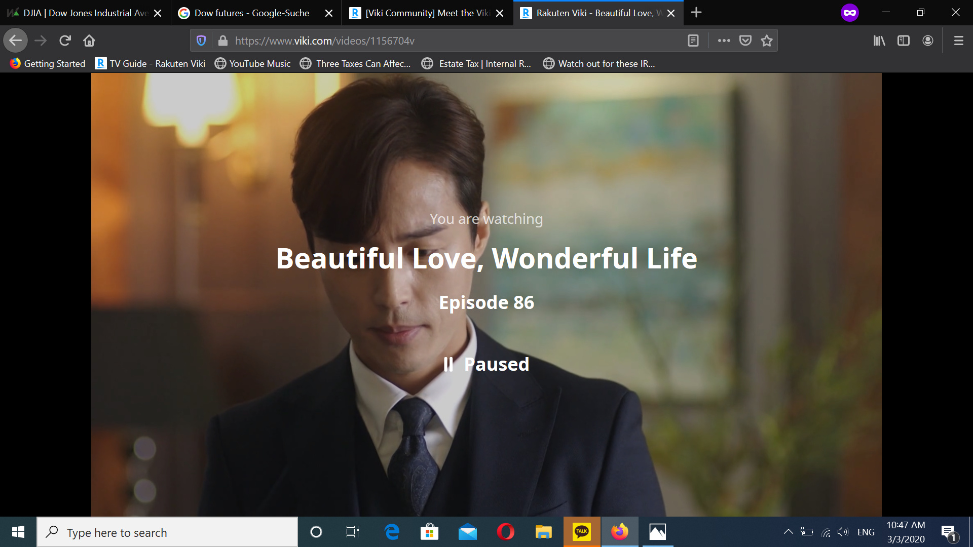
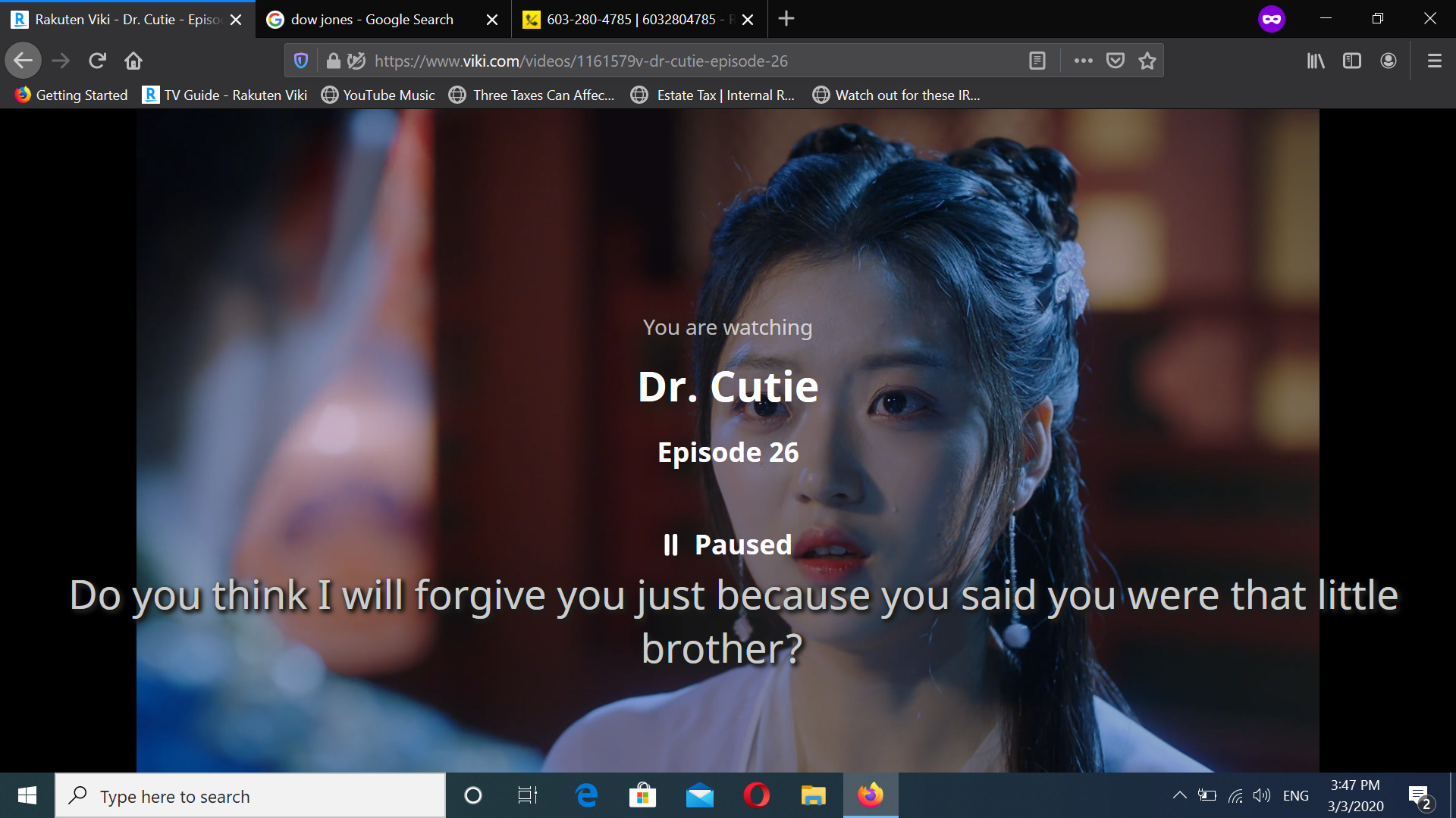
As earlier pointed out the Timed Comments, fat fonts reaching the black left banner, the old ones were easier on the eye, player controls all the way on the left, just why removing it from the middle section… I find it not practical. Then when you stop player all these lettering on the screen… it’s chaotic, next, please let me at least downsize ctrl- the screen size when not in full screen. Next when stopping player how do I get back to Viki home page… the back button just lets me go to the drama…
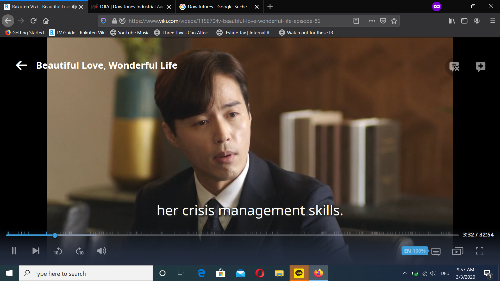
At times subtitles reach over to the black banners right and left, just like TC and the video time line, it’s a serious flaw of design. see screen shot
I truly do not understand how this design is supposed to be better and practical… how designer figure out it’s easier on the eye and management… I truly feel very unhappy… when you had the feedback button I wrote the same negative points out.