This is the moderators’ fault as well. They should appoint someone to do this job. Once the episode is subbed, there won’t be any other sub-whiners.
This new video player made me so angry. I now don’t feel like watching anything here on Viki because of it.
I am really consider going to other sites to completing my dramas!
![]() concernant la nouvelle mise en page vidéo survenue ce Mardi 03 Mars
concernant la nouvelle mise en page vidéo survenue ce Mardi 03 Mars
_ Les sous-titres apparaissent très gros ( et ce n’est pas du un redimensionnement navigateur qui peut s’établir selon …~ Non c’est défini ainsi ) ça peut toujours se corriger éventuellement
_ quand on visionne un épisode … on fait une pause … quand on Actualise … ça ne reprend pas Là Où on s’est arrêté ce qui est apprécié Ici … Non ça reprend du début de l’épisode ^^’
_L’accès une fois la vidéo lancée à la page du drama … pour lire commentaire … détails supplémentaire (comme acteurs ou résumé)
je préfère Nettement la mise en page précédente où il était possible en cours de visionnage d’un épisode de faire pause descendre le curseur et lire commentaire échangés sur épisode en question ( hormis vous l’accorde(lol) des demandes de sous-titres ~ )
voila un premier rendu impression
I discovered rakuten viki only a few months ago and I was very happy to find so many dramas translated into French until today because with the new video player I can watch nothing more than a few minutes because it is all that I am allowed because of my ad blockers which are not accepted whereas before its not posing any problem, I am extremely disappointed to no longer be able to look at the story of Yanxi palace which I loved to watch and that it is only here that I find the full episodes and translated, I seriously think of not watching anything on rakuten viki if they do more for money and not to allow us to see what that we love as before.
That’s very strange. Viki started blocking ad blockers since more than three years ago. How come you could use them until recently?
For all the rest of us, it has nothing to do with the new player.
I have disabled ABP for Viki on my computer. There’s really no need for me that thing is on.
You could try to do the same. You never know, it might work.
@mariliam Hi, sorry for a bit late reply… so the new player invitee has also reached Firefox browser, with no point of return ![]()
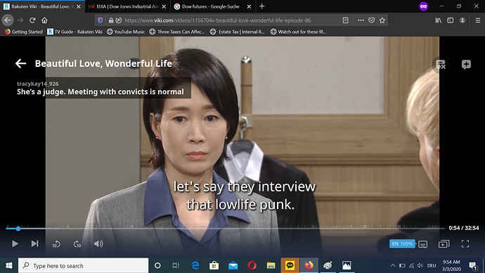
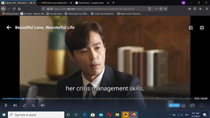
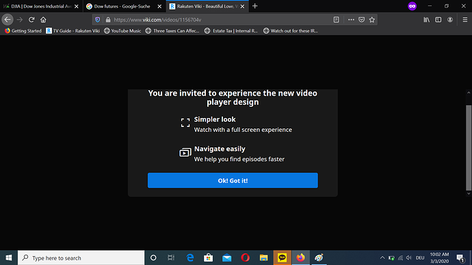
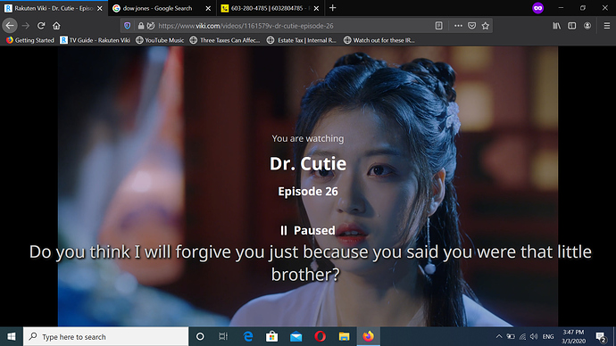
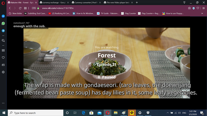
Here are some screenshots, believe me, there are lots of unhappy folks, the visual changes are negative. If you have a chance to compare with old player.
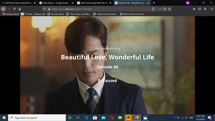
As earlier pointed out the Timed Comments, fat fonts reaching the black left banner, the old ones were easier on the eye, player controls all the way on the left, just why removing it from the middle section… I find it not practical. Then when you stop player all these lettering on the screen… it’s chaotic, next, please let me at least downsize ctrl- the screen size when not in full screen. Next when stopping player how do I get back to Viki home page… the back button just lets me go to the drama…
At times subtitles reach over to the black banners right and left, just like TC and the video time line, it’s a serious flaw of design. see screen shot
I truly do not understand how this design is supposed to be better and practical… how designer figure out it’s easier on the eye and management… I truly feel very unhappy… when you had the feedback button I wrote the same negative points out.
Thank you so much for your feedback @simi11!
I saw you mentioned how the video looked oblong, but I think you were referring to the design itself and not the actual video looking rounded on the edges?
I will make sure to re-share these points with the team again! I do thank you for taking the time to write all this down again for what seems to be the third time. I’m really sorry that that was the case! Let me make sure this reaches the right people this time. ![]()
In reference to your comment about the subtitles sometimes reaching the black banners, this is due in part to missing breaks on subtitles for that particular example. It’s a really good point and something we should be thinking about, for further improvements.
Thanks so much again!
Mariliam
Hello Community Team, thanks for the updates, the little sweet intro and direct email address, to Camille many thanks for being here for us and bonne chance in new department ![]()
I’m currently very frustrated with the new video player, my opera browser shut down and voila the “new thing” is here.
- no settings to turn off TC/ okay I found it
- no Viki dashboard available, have to go back to main page of drama
- TC comments are disastrous, mega bold fonts, line reaches from black ribbon into video
- video commands are placed all the way to the left… middle was just fine… it is really not pleasant for the eye nor to navigate…
- somehow the black border all over seems not proportioned… the video appears extremely oblong… for example Kocowa doesn’t have such bordering whether full screen or not… it’s more pleasant on the eye I’d say.
Is it perhaps just a wrong browser, I feel at loss with how it’s designed, perhaps this is a type of adjustment as other streaming sites, I don’t know… but many like me are very unhappy… any way to get back to the old Video player, merci ![]()
Thanks for reading.
Updates: so apparently on Firefox browser works like the old video player… then it must be Opera issue… unless it’s something else… the picture is still quite oblong
UPDATES: New player is also now on Firefox browser and can’t be changed!
Hi there @simi11,
I’m very curious to see a screen capture of what you’re seeing on the Opera browser! Have you tried another browser like Chrome or Safari? Is it looking similar to what you’re seeing on Opera? Does it happen with all videos?
Mariliam
@mariliam 1 more thing I noticed, when episode finishes and you miss out the end the last screen it shows ist with 2 boxes 1) back to drama page 2) back to viki home page.
Now if I need to replay the same episode or go there where I think was the last part I saw, I can’t go, because the video tools and the line aren’t available. If you remember the old player had this pinkish purple page with giving hearts to the volunteer team and or recommended for you but I believe if I closed that page the episode with player commands was still there and I could replay it without going to drama page, unless I refresh the video link that starts the whole episode anew instead of going where I left off. Personally the line reaching outside the black borders and commands as well is somehow really confusing on the eye. The normal page of video player is a mix of a full screen, just why, I’d like to zoom in.
the pages appear in Firefox the same. I gave up the browser after noticing a 87% usage of my battery… which isn’t good on my laptop. I’m thinking to try Chrome.
Firefox was and Opera is an updated browser.
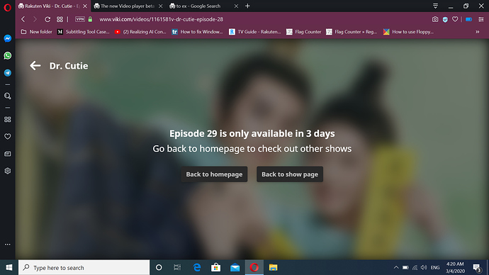
The screenshots in all black are from Firefox the one later in purple is Opera.
As far I remember it was recommended not to use breaks within a text, unless there is a dialog (2 or more person talk), a name/title of something, a text message, or a footnote because the breaks within one or several sentences would look cut differently on other devices like cell phone or tablets.
@mariliam I found the oblong screen, some videos have around it a black thick banner that makes it looking extremely oblong here a screenshot.
@mariliam Could you please ask the developer team to PUT BACK THE AUTOPLAY SWITCH BUTTON… I really don’t want autoplay. I watch sometimes at night and fall asleep, this just drains my battery and unnecessary data, it seems it’s intentional, just why? - I’d really appreciate it, merci ![]()
As of Monday the new player is also fixed on Firefox. I wrote some of the negative points you also write, scroll down further, to Mariliam. If you have a different layout with a different browser than Opera or Firefox than those I posted you are welcome to post them below.
If you watch the video with full screen the black banners dissappear completely and the subtitles fit perfectly. But if the fact, that the subtitles reach the black banners, if you don’t watch in full screen, is due to some missing breaks, I’m just curious, how Viki will resolve this. Since breaks impact the viewing experience while watching on other devices, those breaks are not used anymore for a long time. And I can’t image, that all those dramas and movies would be retrofitted with breaks. ![]()
I just use my keyboard to control the player – the arrow keys to rewind/move forward, the spacebar to pause/resume, Alt+F to enter/exit fullscreen – so I’m fine with it as a Viki subscriber.
Just please ensure that the translators and editors are able to use it properly. Without them, it’s pointless anyway.
When using the new video player on the viki website, is there a way to view the comments for each episode? I can find them when I use the app, but can’t seem to find them when using the website.
Dear Mariliam,
you can say that all the rest is a question of personal taste: the enormous thick font for comments and series title, the placing of the commands, the claustrophobic shut in and so on.
But what about italics? Are you really banishing italics for flashbacks?
Is this a decision that has been made, or just a temporary bug?
Should we stop bothering with italics?
They are really useful for viewers, because sometimes it’s confusing to them whether it’s a flashback or not.
Hi there @somejuwels @simi11,
I have updated the article for clarity. The only app that is currently unable to render breaks is Roku. The recommended guideline is to add breaks with an additional space to avoid sentences from running together.
Breaks can be used without any trouble at all as long as we follow those guidelines. The only thing we ask contributors is to not use breaks without dialogue (empty segments with only <br> HTML), or to have consecutive breaks within a segment (dialogue <br><br>dialogue).
@angelight313_168 / @irmar - Regarding italics, we have logged a bug about this with the team. The issue with italics not rendering is only affecting Chrome at this time. All other browsers are working correctly. We expect the bug to get fixed in the next few weeks.
@et_865 - Video comments have been disabled on this new player version. You can find Viki (Disqus) comments on the Channel page.
Thank you so much to everyone for their feedback! I will make sure to share this with the team for future improvements.
Happy watching,
Mariliam
@mariliam Thank you very much for that clarification about the breaks.
Maybe I came here a bit too late but the new player started for me only yesterday. I have another issue with it (relating to the fact that nothing but the video can be seen on the page) is the fact that I can’t see my inbox icon above anymore. I used to always check if I have any messages when I am moving from episode to episode. Also, my habit was that when I am done watching, I go to my profile page directly from the bar above, but now I am forced to go to the drama’s main page first. It’s not a huge problem but it was still better at first. I will just need to follow new habits and that’s okay with me.
The only problem I had with the old player was that when my internet got temporarily “cut” or was a bit slow, the video used to stop and never continue loading even if the internet was back. I had to refresh the page every time something went wrong with the router. This issue was not there for the phone app. I hope at least that this would not happen with the new player.
