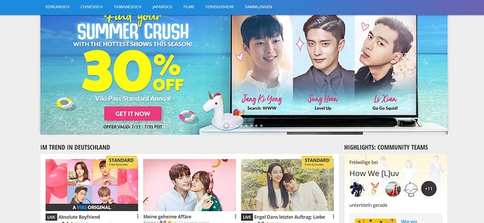
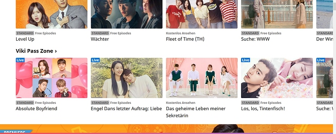
I have to scroll a full 2 more times to get to the bottom of the page because of the enormous ads. I find the thumbnails jumping off the screen just… annoying.
I really like that it allows you to see immediately what program and episode you were last watching. I guess that is very viewer oriented but as a viewer I like it. I find it a bit difficult to get to where I left off on the phone app.
In my current page I have a link up in the righthand corner that I click to go to my Last watch episodes and a tab there for my collections.
But now they have moved Last seen and Collections further up on the Beta version so it’s better.
But I still don’t like the layout because it’s too big, both images and fonts, for larger screens. I hope they fix that.
Shouldn’t it be responsive, i.e. a smaller version for cellphones and tablets?
It should be responsive, adjusting to screen sizes. After reading the issue description, i think the issue is not that its not smaller on the smaller screen, just that it feels too big in general compared to the old design. Am i reading that right? Care to share your screen shot for old and new homepage, i am curious to see the effect about what you are mentioning. I can see mine, but womdering if some OS or browser differences are exaggerating the effect for you
Yes, it’s suppose to be responsive. Right now it looks like it’s the same size as for mobile which always look too big for larger screens. Hopefully they will edit it.
Right now I have 90% zoom level on this board because the font is too large on my laptop.
See if anyone else is on a laptop and agrees with me.
The pictures and the font are too large, also the banners doesn’t really fit plus while scolling it has a delay that wasn’t there with the old version.
So overall worse than now imo.
Old - with! language header:
New: Super crowded and ugly and without language header:
Same browser scaling. Just that the beta layout looks terrible. And is bad for scrolling on PC. The old design has some space at left and right side of the page while the beta design puts everthing on the ends of the screen (left/right side).
That’s what bothered me so much. It’s really “to much”.
Rather than having a new website look, I wish there was a way to make people stop rating down a show because there are no subtitles in their language.
Yeah, I mean… there are so many issues, so many improvements we’ve asked for, and all they care about is giving a new look to their homepage AGAIN? It’s like spitting on our faces.
And WHY must every page looks the same?
I am glad that viki and fb doesn´t look the same like ■■■■■■■, insta, bla.
SO why to change the page? The 10000 bugs should be disappear instead
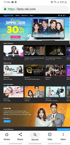
Hmm. My mobile version is bigger, i trick it into smaller with desktop version!
My mobile view
Screenshot_20190718-174659_Chrome|243x500
Desktop version:
Wonder if that helps, though if you dont have high speed network, it might load very slowly which sucks.
The density is higher in the new page.
To be honest, on phone i just use the app, but i know thats not what all prefer and volunteers need to use the website
For the Watching History, in the previous design I was able to enter the main drama’ page from click on the drama name, I don’t necessarily need to go to a certain episode first.
But in the New design I can’t do that. I always has to enter an episode to be able to go to the main page of the drama.
So, lately I’ve been seeing only the old version of the homepage. What happened?
You’ve been lucky? Cuz I only see the new version lol
I have the old version with a slightly different scale of the pictures and different header but that’s fine. If it stays like that I’m happy.
And if they also fix the subtitle tool even more… since they brought the beta version I have to often not working subtitling tool, meaning that either it crashs and deletes my subtitles or blocking me from entering the subtitling tool with an error message and new subtitling tool layout…
Then I usually have to wait a day or even more until I can get to the origin subtitling tool again.
Oh, you should report it to the support center. Subbing tool errors are super important to report as soon as possible. ![]()
And now the old version is back. Since I’m still logged in it’s not cached or similar issue.
Very strange that it jumps back and forth.
I suddenly get the terrible ugly oversized scaled new page … with default black…
I just want to keep the old style ![]()
wow, I just discovered I can access both the old and the new.
The old design:
https://old.viki.com/
The new one:
P.S. you can make it white from the moon on the top right. (at least that’s the case with mine)


