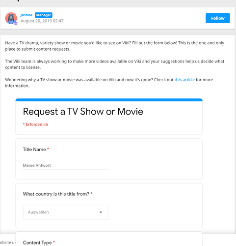
@lutra The form is imbedded in the page of Help Center, Win 10 n Opera
Does it has something to do with accepting cookies, perhaps??
Don’t know, I was able to access it a while ago, I don’t know why it is like this now. And I can see the request form for subtitles, so other pages of that kind work for me.
I am waiting my request is still open, I wonder what the next reply will bring.
The Watch Party button has to be on all shows.
Go to shows like Imitation and So I Married The Antifan. Do you see the bell icon there?
I’ll give it a few more days. I’ll see if I get any updates from the app store. This may iron out the issue.
Thanks! ![]()
I can only do Discussions on my LapTop! I cannot see those on my app on my phone! I have tried to go to laptop view from the regular site but it always flips me back to the app so that is frustrating. In my collections, on my app on my phone you cannot see any of the photos etc that are posted. I can only see those on my laptop
Yea, Viki’s changes toss everyone around like tossed salad.
I only wanted to know, if anyone else has this issue, I already have an open ticket.
It so happens that’s all I see the 404 Error. I don’t even have the option of going to inbox in any which way or form. I wonder how long they’re planning to keep this up with no solution in sight.
Hi @lutra
if I have noticed this topic earlier, there would have been no need for you to raise a support ticket as I had the very same issue with the contact request form a few months ago and submitted a ticket. Viki responded and told me that I needed to have all cookies enabled on the help site in order for the content request form to appear and be used.
I think it has something to do with the fact that it’s a Google forms form which is embedded into the help page and as such is rather cookie heavy.
Good thing about help site is that cookies are easy to adjust, so you should be able to just turn them all on in order to use the contact request form and then turn them off again when you have finished using the form. If you don’t want them enabled
The link to adjust cookie settings on the help site should be towards the bottom right of any page on the help site.
I will try, the weird thing is that the subtitle request form is there, so?
I downloaded the Viki app temporarily on my Android phone yesterday.
I’m both surprised and annoyed at the fact that the entire Subtitle Team isn’t displayed!! There’s just one sentence that says “Subtitles done by _____ Team” and it was so hard to spot even that!
If I log in to Viki from the mobile browser, the format is almost the same as the desktop one.
How can we blame people for not knowing this is a volunteer based site when the volunteers themselves are hidden?!
I hadn’t seen this topic before. When I first started watching Viki it was on an iPad mini using the app. I did that for two years and then recently got notified that my version of the iPad was too old and would no longer support any updates to the Viki app. I then started using the website on my laptop and was surprised at how completely different the UI is from the Apple app. I recently got an Android tablet device and downloaded the app. The android version of the app is nearly identical to the website UI. There were functions/differences that I actually preferred on the Apple version of the app, but there are also things on the website/android app that I prefer. It’s very strange to me that the two are so very different.
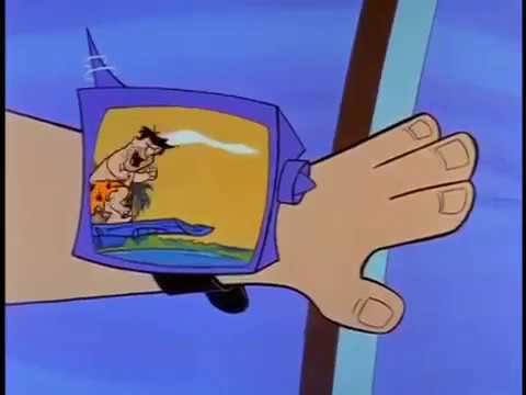
I prefer to watch TV on my big screen tv. I am not into Leroy Jetson’s teeny tiny tv watch. ![]()
![]()
![]()
![]()
![]()
![]()
Viki doesn’t work on my Kindle Fire.
I like to have the screen right up in my face. ![]()
![]() Or at least I like to snuggle into my bed with my tablet for late-night drama watching.
Or at least I like to snuggle into my bed with my tablet for late-night drama watching.
I was never into watching tv in bed.I stay up until I am sleepy, then I hit the sacek.
I like the UI of the current version. However, there were some features in previous version that are missing in this one and were also useful. First, there was this menu to change your subtitle language without going inside the video. I volunteer for quite a few languages, that option was useful for me to see which episodes are done in which language.
Also, my viewing language is set to Hindi (so that I am updated on the progress), I do sometimes watch in Hindi, but mostly I watch with English subtitles. If there is a show which is subtitled to Hindi, I switch my language to English but sometimes forget to switch the language back. Previously, I could just switch languages from the main page of any drama, but now I need to go into any video to switch my language, which affects my watch history. (Or is there any way to do the same which I am unaware of?)
Then, in previous version, the coming soon shows had the dates written on them when they are going to be released (if their dates were finalized). With the new update, I can no more see when coming soon shows are actually going to be released.
I am also disappointed with this function. I thought they would at least show avatars of team members but there is just this line which no one will bother about anyway.
really? I don’t remember ever seeing dates…
only some coming soon dramas show the “Available in ______ days” sign. Some don’t. I wonder what’s up with that.
lol me too!! I like having the screen in my hands so I can keep plaguing the TCs with my terribly smart and funny comments ![]()
SAME
I sit at my laptop on these stupid hard chairs because I can have my BIG screen and I can go back and forth into Discussions to hang with you guys.
I still see so many glitches between what I can do on my laptop and on the app! And you have to know how to “tweak” it so you can do what you want in your collections etc.
I typically watch from a desktop computer or Fire TV. The desktop experience is mostly alright, but I have a few major complaints:
- I’ve never enjoyed the way the Continue Watching tab jumps directly into the show you click on. I would prefer if we could instead click on the title of a show to pull up the full listing, as I tend to hold small watch parties and rewatch shows with different groups of friends. With this issue, I usually have to click the show, wait for it to load, then back out into the menu.
Watch parties can be somewhat inconvenient as they have to be ended and restarted per episode with the current interface. The ability to switch shows or at the very least continue to the next episode would be greatly appreciated.Apparently this is inaccurate… my mistake!- The quality in a web browser isn’t always the best it can be. While I understand this is a limitation that can’t be helped, it makes a world of difference watching on a TV instead… and that’s exactly why I’d love a desktop app if possible. I realize this is an uncommon and difficult request with not much payoff, but if done correctly it would be a huge improvement over the current experience for my setup.
- When browsing actors and cast, I feel that the lack of a spot for Director is a glaring omission. I usually follow directors that I respect and trust to make something worth watching time after time regardless of cast, which is difficult to do through Viki when directors are listed in the description with no links at best. This goes for all platforms, really.
- Some coming-soon shows lack any kind of watchlist option at all, which can be frustrating as they can quickly moved out of place by newer shows.
These are all nitpicks on what has otherwise been a solid streaming experience.

