Wouldn’t it be difficult to organize a drama when the CM isn’t able to check the episodes? I mean when it’s a real non available licence and not just a QC only access.
2 Likes
Btw, in the old mode the CM forms didn’t work for me (somehow filling them in was disabled), but with the new mode it’s fine. ![]()
Hi, can you tell me how to follow a show on the new channel page? I only found the option to add to watch list. Thanks.
Click on the bell.
2 Likes
Thanks! I thought the bell was some kind of notification ![]()
1 Like
They do notify you about new episodes. ![]()
1 Like
It has its pros and its cons. The best thing is that you can go easily to the part that you want, without interminable scrolling through boring cover pages full of full poster portraits for each and every main and second lead and especially those useless thank you cards. I find most cover pages to be much too long.
However it’s not fair to bury them like that either. Some of them have beautiful artwork and they are a joy to behold. Their place is definitely on the first tab, just under the synopsis and actors.
Here is what I wrote on the feedback form:
What I didn’t like:
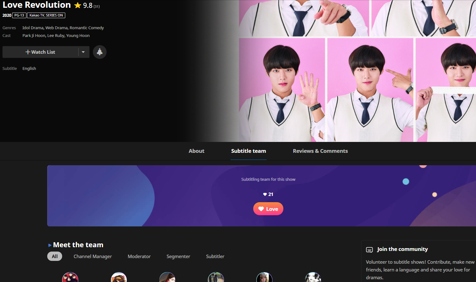
In the old page, there was only the team name with just a few avatars for decoration. You clicked on the team name and you could see many of them in the modal page. Now the team members are not immediately visible. But on the page where they are, they are TOO visible, they take too much space, and if one didn’t know, they would never scroll down to see the cover page. It’s like bundling the “modal page” with the cover page, and the cover page gets buried.
Suggestions:
- Put the cover page on the first page, just below the synopsis. Maybe the cover page could be in two parts: one with info about the show (without the team contributors list) on the main tab and one other part, the contributors list, in the Subtitling team tab.
- The link to the team should go to a page or tab where they are put in an orderly way, just as you have them. But that page should only have volunteers, not the cover page below. Maybe, as I suggested above, the lower part of the cover pages, the one with the list of mods and all info on reaching them, which one is recruiting etc.
- The comments are too buried. What about having their own separate tab?
4 Likes
how can i get the new page back
@mira_baby ou are getin it automaticly
Looks nice but too many clickings just to get to another page. Eg. the comments in the old page can be read simply by scrolling down the page. Now, it’s click to next page, etc.
When I want to sub, the old page allows me to see which is not fully 100% yet and I can just go directly there. Now, I need to go through the range of episode, eg. episode 20 - need to click to the next range. Time consuming.
3 Likes
On the new channel page the reviews come before the comment section. Great! Now we’ll have even more fake reviews rating it low because there are no subs in their language. ![]()
![]()
5 Likes
It was that way in the old channel page too. You had to scroll quite a bit to find the comments. Supposedly you could click on the little cloud image on the top right to be taken to the comments directly, but that didn’t work that well: it usually took me only until the middle of the cover page.
I know, I just didn’t express myself well. The number of reviews you need to scroll is higher than the ones in the old channel. On the old page for “Lonely Enough to Love” I can see only three reviews while on the new I have to scroll through six.
1 Like
That’s true. They thought that hey, since reviews and comments have their own tab, we can show more of them. Which makes sense, in a way.
1 Like
I know this may be a bit off-topic but I didn’t want to start a new one because of this. Just wanted to know if you ran into something equal and since I don’t have access to the new page at the moment …
This week I had message in my inbox for a request to be Portuguese moderator for the only channel I have ever managed. I was surprised so, the only thing I wrote back was this one line - Do you have access to the movie?
And guess what the conversation was actually closed by the writer yesterday. Just like that.
As far as I heard there is no more license for this movie anywhere.
So why do I write, is there a way you could miss out on the “no license” issue at the new page.
At the old page you seriously can’t not see it, but how about the new one.
https://www.viki.com/movies/6253c-yeosu
1 Like
Whatever the case, the person was really rude.
Well, I got a bad memory, but unfortunately I often recall those …
Lucky for them I don’t intend to be CM again.
2 Likes
The info is given in the new layout:

I assume they didn’t want an answer by leaving and if leaving was a mistake, they’d send you again a new message.
Well I know it’s kind of a German trait (to go directly to the bottom of things - it can be a little too direct for others but I just don’t like beating around the bush), but I sent a message back, and we will see. In case I don’t get an answer I will assume this volunteer is on a spring to collect moderator jobs, but as others mentioned, I am in some points optimist, so as long as … I will think it was a “mistake”.
2 Likes
A brief digression, sorry:
I read some opinions on Quora (credits to authors):
“Is it true that all Germans are direct?”
-
“No. But generally we will be more direct than others in comparison. We do have the tendency to not praise anything, a nod is as much appreciation you will get for good work done.
If there is a mistake or a flaw, we will often call it out, not to shame anyone, but to root out the source of this. As it happens we might conclude that the flaw is actually a person, so that will come off as insulting.” -
“No. People are different here as everywhere in the world.
Nevertheless, our social behaviour and culture is western and not asian, so we communicate in a direct, strict and honest manner […]”
Apparently (a generality, each one is different of course):

Credits: I’ve noticed that the French, debate, protest…
For French people, the “trait” (a generality, each one is different of course): debate.
-
“Debate and confrontation are welcomed, as they help two opposing parties to express their respective opinion and possibly reach a point where they can agree to disagree and still respect each other. This is probably one of the reasons why the French rank number one in Europe when it comes to expressing discontent.”
-
“We debate vehemently in order to test proof our arguments. We don’t debate to prove to others we are right. We debate to prove to ourselves that our ideas can survive the debate. We don’t educate others, we educate ourselves.
Of course, we pretend we are trying to convince others. That’s necessary for the debate to be fruitful. But we want the other part to have strong arguments. Otherwise, it is useless.
Note that we know that the debate doesn’t prove anything. Convincing the other part doesn’t prove you right, and not convincing doesn’t prove you wrong. But both enrich and strengthen your knowledge and understanding of the subject.
What we dislike the most? Debating with someone who have the same ideas as ours. What’s the point? This is boring. We like virulent debates with people who have very different points of view. We don’t want to convince them. We want to convince ourselves. Of course, we prefer to convince ourselves that we were right. But if we eventually convince ourselves that we were wrong, at least on some aspects, we are not losing anything. In this kind of debate, there is no loser. Everybody win.” -
“Cartesian logic and the Socratic method. They involve looking at things from different angles. The French love reasoning, argumentation, logic and discussion. The purpose is to learn more about the world by developing a spirit of inquiry.
I was raised in an English-speaking family and attended an international school run by the Government of France. It gave me an interesting view of the world. The French love to debate and the English take pride in their efficiency. The two are not incompatible in one brain! You just have to gauge the way your interlocutor thinks to ensure you understand each other.”
–
To come back to the new layout:
-
hearts given to volunteers: can’t give them anymore at the end of an episode, moved to team tab and viewers don’t go in the team tab. A lot of recent complete shows have very very very few hearts.
Suggestion: put back “give hearts” at the end of each episode, except for the last ep: fine with the review stars option. -
the exact Broadcast Period: we only have the year of broadcast.
Suggestion: keep the year like it is and put in addition the exact broadcast period (full date) somewhere so volunteers know since when exactly it is on Viki / when it will be here and when it will end. -
the language for reviews: we can’t pick the language anymore, so we have to go through all reviews in all languages to be able to as a viewer: if I want to read a review in my language to pick this show to watch (I can’t read or understand Italian, Arabic, German…) / as a moderator : to moderate and flag => not convenient.
If I can’t look for a review in my language, the review section is only to give reviews, but not to read reviews and decide.
Suggestion: put the languages selection back for reviews -
accent is given to the CM when we enter a page of a channel looking for a CM: good.
The “i” for information: nothing happens when we click on it.
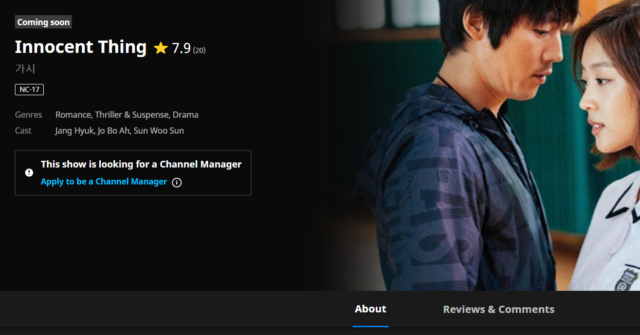
Suggestion: hover the mouse over “i” and people read directly an explanation about what a CM is.
The text disappears when we hover the mouse somewhere else on the screen.
- comparing accent given to CM recruit / other volunteers recruit (subbers, segmenters, mods).
I find it’s not shown enough on the main page, we got to go on “sub team” then “join the community”
Suggestion: when the CM is picked, instead of the box “This show is looking for a CM”, update it with " Volunteer to subtitle shows! Join community". Show it there and on the sub team tab (2x).
- Unlicensed info: good.
Suggestion: hover the mouse over an “i” icon to explain the term “unlicensed”. Will it be available? Do viewers have to do something? What is it?
-
the number of followers: unknown now. How do we know it’s popular?
Suggestion: put this info back? -
the bell icon: what is it?
Suggestion: hover the mouse over the bell, explain what this bell is. -
the zoom ratio: really big for me.
100 % zoom appears almost the same as 50 % zoom.
The page is divided in 2: 50 % the Viki image on top (what we see when we enter), 50 % the info at the bottom (what we see when we scroll down).
The Viki image on top I think takes too much place, that is why I have to scroll down on each page even when the zoom is 25%.
100 % zoom on laptop screen (see screen below):
I only see this screen before 1st scroll down, that is to say the Viki image only and not the info I expected to see.
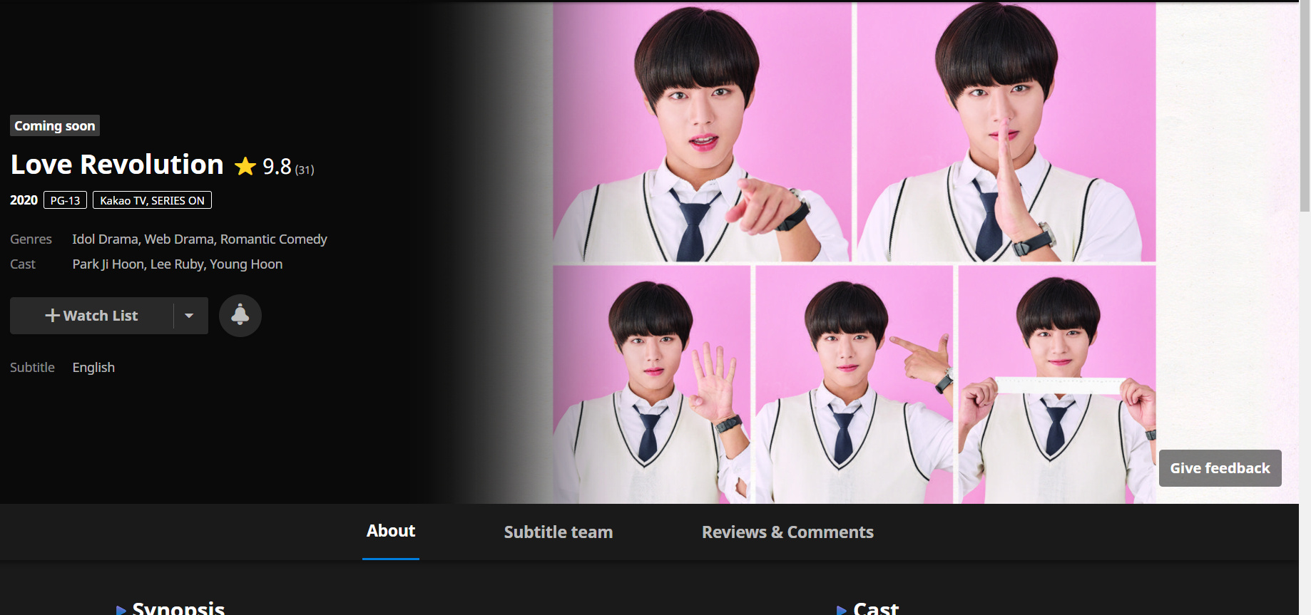
25 % zoom (see screen below):
I still only see this screen before 1st scroll down, that is to say the Viki image + a little of the info I expected to see.
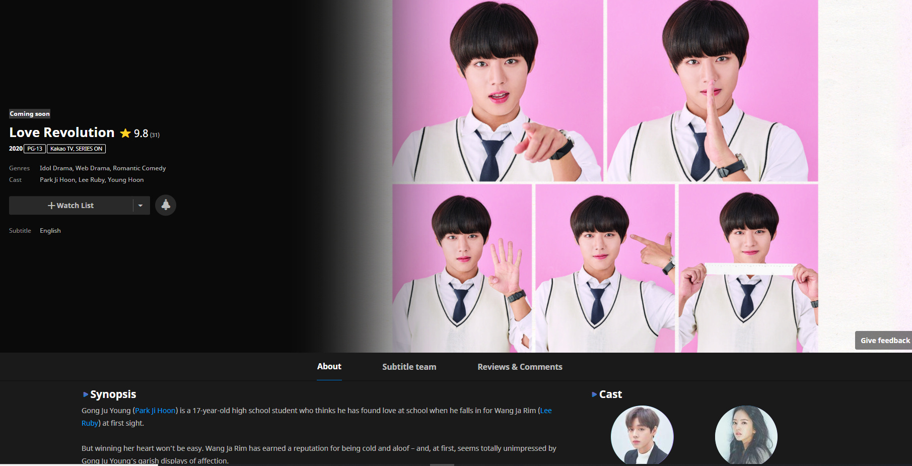
The image is only important to see once.
For the episodes tab, the most important tab for a viewer: we are unable with 100 % zoom to reach an episode without having to scroll down.
Suggestion: review the zoom ratio.
Maybe reduce the Viki image on top and put the range of tabs “About, Subtitle Team…” higher on the screen.
On the episode tab, put the link of episodes higher on the screen, so when we go on this tab, we can still click on them without scrolling down.
Navigating between 1 show page, the explore page of shows and profile pages: can’t use the same zoom % because of above, not convenient if we have to change zoom % to navigate.
Zoom 25 % explore page (compare with the 25% screen above and this screen):
3 Likes